
DataQuest 3: Step 2 - Data Visualization (Exploratory & Stotytelling)
Posted on 10/10/2018, in Data Science, Python.This note is used for my notes about the Data Scientist path on dataquest. I take this note after I have some basics on python with other notes, that’s why I just write down some new-for-me things.
- Mission 142: Line Charts
- Mission 143: Multiple plots
- Mission 144: Bar Plots And Scatter Plots
- Mission 145: Histograms And Box Plots
- Mission 146: Guided Project: Visualizing Earnings Based On College Majors
- Mission 147: Improving Plot Aesthetics
- Mission 148: Color, Layout, and Annotations
- Mission 149: Guided Project: Visualizing The Gender Gap In College Degrees
- Mission 152: Conditional Plots (Titanic)
- Mission 150: Visualizing Geographic Data
- More tools
Mission 142: Line Charts
import pandas as pd
import matplotlib.pyplot as plt
pd.to_datetime(<series>): converts strings inside a series to a datetime objects- Extract
month:unrate['DATE'].dt.monthreturns series containingint
- Extract
- plot nothing then default axus range is
[-0.06, 0.06] - Plot by
plt.plot(x,y)and the show it byplt.show() - Change, rotate,… ticks:
plt.xticks(rotation=90) - Plot info:
plt.xlabel(),plt.ylabel(),plt.title()(title of the plot)
Mission 143: Multiple plots
-
Add subplot (top-left to bottom-right) (multi plots in the same figure)
import matplotlib.pyplot as plt fig = plt.figure() ax1 = fig.add_subplot(2,1,1) # 2rows, 1cols, plot_number 1 ax2 = fig.add_subplot(2,1,2) plt.show()- Use
ax1.plt(x, y)as usualplt.plot
- Use
- Change size of figure
fig:plt.figure(figsize=(width_inch, height_inch)) - Use many times
plt.plot()to draw multi function on the same plot. - Use
plt.plot(x, y, c="red")to choose a color for plot. See more here. plt.plot(x, y, label="<label>")legend and thenplt.legend(loc='upper left'), read more here.-
Note: there is diff between
x_axis_48 = unrate.loc[0:12,["MONTH"]] # wrong
x_axis_48 = unrate[0:12]["MONTH"] # right
Mission 144: Bar Plots And Scatter Plots
fig, ax = plt.subplots()
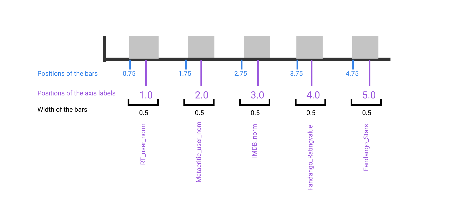
# Positions of the left sides of the 5 bars. [0.75, 1.75, 2.75, 3.75, 4.75]
from numpy import arange
bar_positions = arange(5) + 0.75

# Heights of the bars.  In our case, the average rating for the first movie in the dataset.
num_cols = ['RT_user_norm', 'Metacritic_user_nom', 'IMDB_norm', 'Fandango_Ratingvalue', 'Fandango_Stars']
bar_heights = norm_reviews[num_cols].iloc[0].values

ax.bar(bar_positions, bar_heights)
- the width of each bar is set to 0.8 by default.
-
plt.subplot(): generate single subplot + returns both figure and axes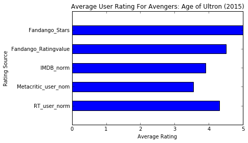
num_cols = ['RT_user_norm', 'Metacritic_user_nom', 'IMDB_norm', 'Fandango_Ratingvalue', 'Fandango_Stars'] bar_heights = norm_reviews[num_cols].iloc[0].values bar_positions = arange(5) + 0.75 tick_positions = range(1,6) width = 0.5; fig, ax = plt.subplots() ax.bar(bar_positions, bar_heights, width) ax.set_xticks(tick_positions) ax.set_xticklabels(num_cols, rotation=90) ax.set_xlabel('Rating Source') ax.set_ylabel('Average Rating') ax.set_title('Average User Rating For Avengers: Age of Ultron (2015)') plt.show() ax.bar: verticle bar plot.ax.barh(bar_positions, bar_widths): create a horizontal bar plotbar_positions: specify the y coordinate for the bottom sidesbar_widths: like bar_heights
- Note that: there is diff between pos of
ax.barhorax.barbefore or afterax.set_xticksorax.set_yticks. It should be before! - ax.set_xticklabels() takes in a list.
-
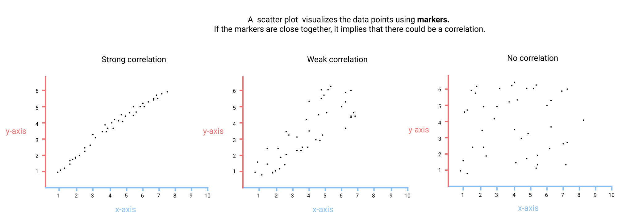
ax.scatter(x, y): scatter plot (plot with dot)fig, ax = plt.subplots() ax.scatter(norm_reviews["Fandango_Ratingvalue"], norm_reviews["RT_user_norm"]) ax.set_xlabel("Fandango") ax.set_ylabel("Rotten Tomatoes") plt.show() ax.set_xlim(0, 5)and.set_ylimto set the data limits for both axes. We also zoom in the plot with these commands.- By manually setting the data limits ranges to specific ranges for all plots, we're ensuring that we can accurately compare.
Mission 145: Histograms And Box Plots
- Using
s.value_counts()to display the frequency distribution. - Don’t forget to
s.sort_index()to sort the indexes.
- Diff between histogram and bar plots
- hist describes continuous values while bar plots descibes discrete
- there is no space between each bin
-
location of bars on x-axis matter in hist but not in bar plot.
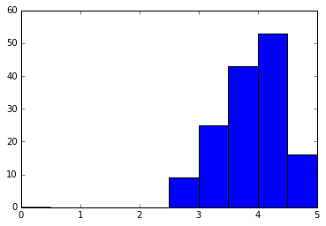
# Either of these will work.
ax.hist(norm_reviews['Fandango_Ratingvalue'], 20, range=(0, 5))
ax.hist(norm_reviews['Fandango_Ratingvalue'], bins=20, range=(0, 5))
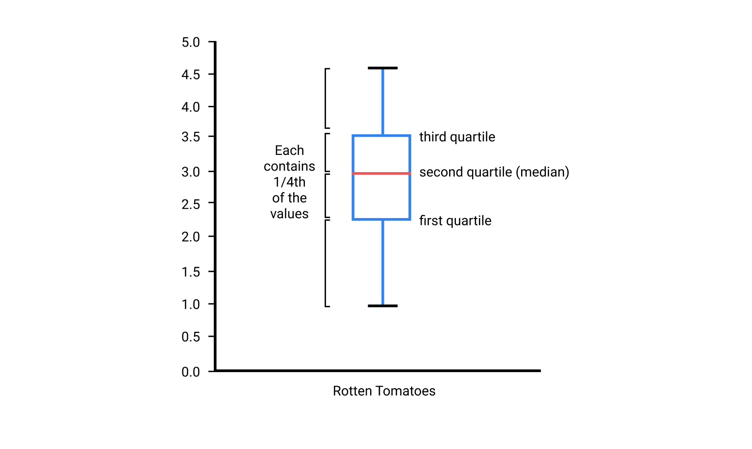
- quartile is diff from histogram because it divides the range of values into four regions where each region contains 1/4th of the total values.
- While histograms allow us to visually estimate the percentage of ratings that fall into a range of bins.
- To visualize quartiles, we need to use a box plot (box-and-whisker plot)
-
quartile is a case of quantile which divides the range of values into many equal value regions.
ax.boxplot(norm_reviews["RT_user_norm"])
# multi boxplots
num_cols = ['RT_user_norm', 'Metacritic_user_nom', 'IMDB_norm', 'Fandango_Ratingvalue', 'Fandango_Stars']
ax.boxplot(norm_reviews[num_cols].values)
Mission 146: Guided Project: Visualizing Earnings Based On College Majors
- Do students in more popular majors make more money? $\Rightarrow$ Using scatter plots
- How many majors are predominantly male? Predominantly female? $\Rightarrow$ Using histograms
-
Which category of majors have the most students? $\Rightarrow$ Using bar plots
- Jupyter’s magic
% matplotlib inlineso that plots are displayed inline - Use
df.iloc[]to return the first row formatted as a table. - Use
df.head()and DataFrame.tail() to become familiar with how the data is structured. - Use
df.describe()to generate summary statistics for all of the numeric columns. - Number of rows :
df.shape[0]or number of columnsdf.shape[1] -
Pandas has it own a plot method, see here.
recent_grads.plot(x='Sample_size', y='Employed', kind='scatter')
# 'Sample_size' and 'Employed' are columns of recent_grads
We can use one-line code because of
% matplotlib inline(of Jupyter) - We can use
s.plot() -
We can control the number of bins in series by
s.histrecent_grads['Sample_size'].plot(kind="hist", rot=40) # rot = rotation recent_grads['Sample_size'].hist(bins=25, range=(0,5000)) -
scatter_matrix()can plot scatter and hist an the same time for 2 columns (ref)from pandas.plotting import scatter_matrix scatter_matrix(recent_grads[['Women', 'Men']], figsize=(10,10))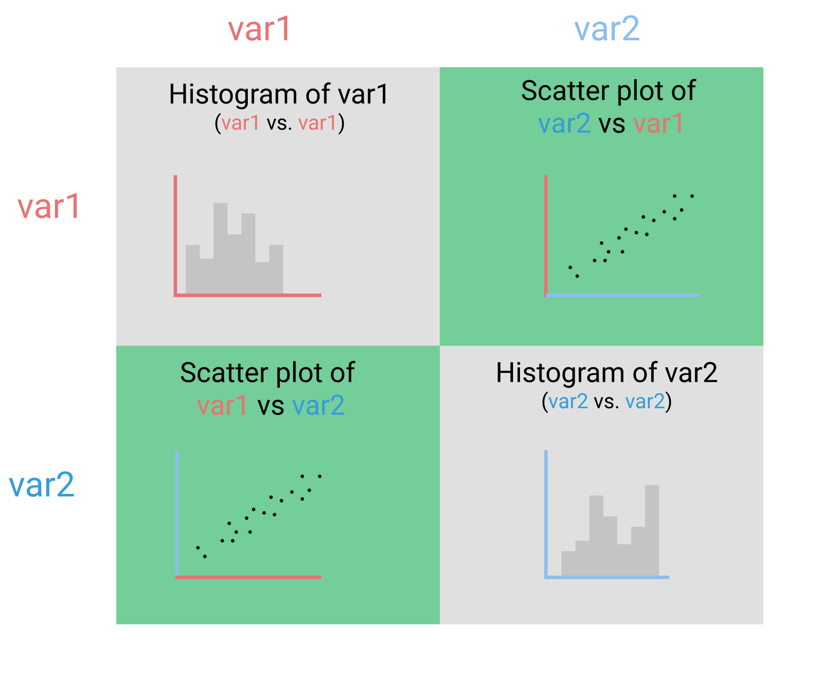
-
Normally, when using bar plot, we need to specify the locations, labels, lenghts and widths of the bars but pandas helps us do that
# first 5 values in 'Women' column
recent_grads[:5]['Women'].plot(kind='bar')

# or better with labels
recent_grads[:5].plot.bar(x='Major', y='Women')
Mission 147: Improving Plot Aesthetics
-
2 line plot in the same figure
fig, ax = plt.subplots() ax.plot(women_degrees['Year'], women_degrees['Biology'], label='Women') ax.plot(women_degrees['Year'], 100-women_degrees['Biology'], label='Men') ax.tick_params(bottom="off", top="off", left="off", right="off") ax.set_title('Percentage of Biology Degrees Awarded By Gender') ax.legend(loc="upper right") - The data-ink ratio is the proportion of Ink that is used to present actual data compared to the total amount of ink (or pixels) used in the entire display. (Ratio of Data-Ink to non-Data-Ink). The goal is to design a display with the highest possible data-ink ratio.
-
Modify/Remove ticks on axes & remove axes spine:
ax.tick_params(bottom="off", top="off", left="off", right="off", labelbottom='off')
# Add your code here
ax.spines["right"].set_visible(False)
ax.spines["left"].set_visible(False)
or shorter for spines
for key,spine in ax.spines.items():
  spine.set_visible(False)
Mission 148: Color, Layout, and Annotations
- The Color Blind 10 palette contains ten colors that are colorblind friendly.
-
Matplotlib expects each value to be scaled down and to **range between 0 and 1 **(not 0 and 255 of RGB color).
cb_dark_blue = (0/255,107/255,164/255) ax.plot(women_degrees['Year'], women_degrees['Biology'], label='Women', c=cb_dark_blue) - Line width:
ax.plot(linewidth=2) - Annotation:
ax.text(<x>, <y>, <text>) -
Big figure
figand then inside there are multiple plotaxfig = plt.figure(figsize=(18, 3)) ax = fig.add_subplot(1,6,sp+1)
Mission 149: Guided Project: Visualizing The Gender Gap In College Degrees
ax.set_yticks([0,100]): just keep 0 and 100 on the y ticks, orxticks- transparency:
ax.plot(c="red", alpha=0.3) - Horizontal line in the figure:
ax.axhline(<startpoing>) - Note that, all coordinate in the plot is the coordinate of the axes (depends on the data)
-
Save the plots (must be used before
plt.show())plt.plot(women_degrees['Year'], women_degrees['Biology']) plt.savefig('biology_degrees.png') plt.show()
Mission 152: Conditional Plots (Titanic)
- What you need to know for now is that the resulting line is a smoother version of the histogram, called a kernel density plot. Kernel density plots are especially helpful when we’re comparing distributions.
- Plot kernel density and histogram together.
import seaborn as sns import matplotlib.pyplot as plt sns.distplot(titanic["Fare"]) plt.show() -
Plot only the kernel density plot
sns.kdeplot(titanic["Age"]) -
Style of
seaborn(default isdarkgrid),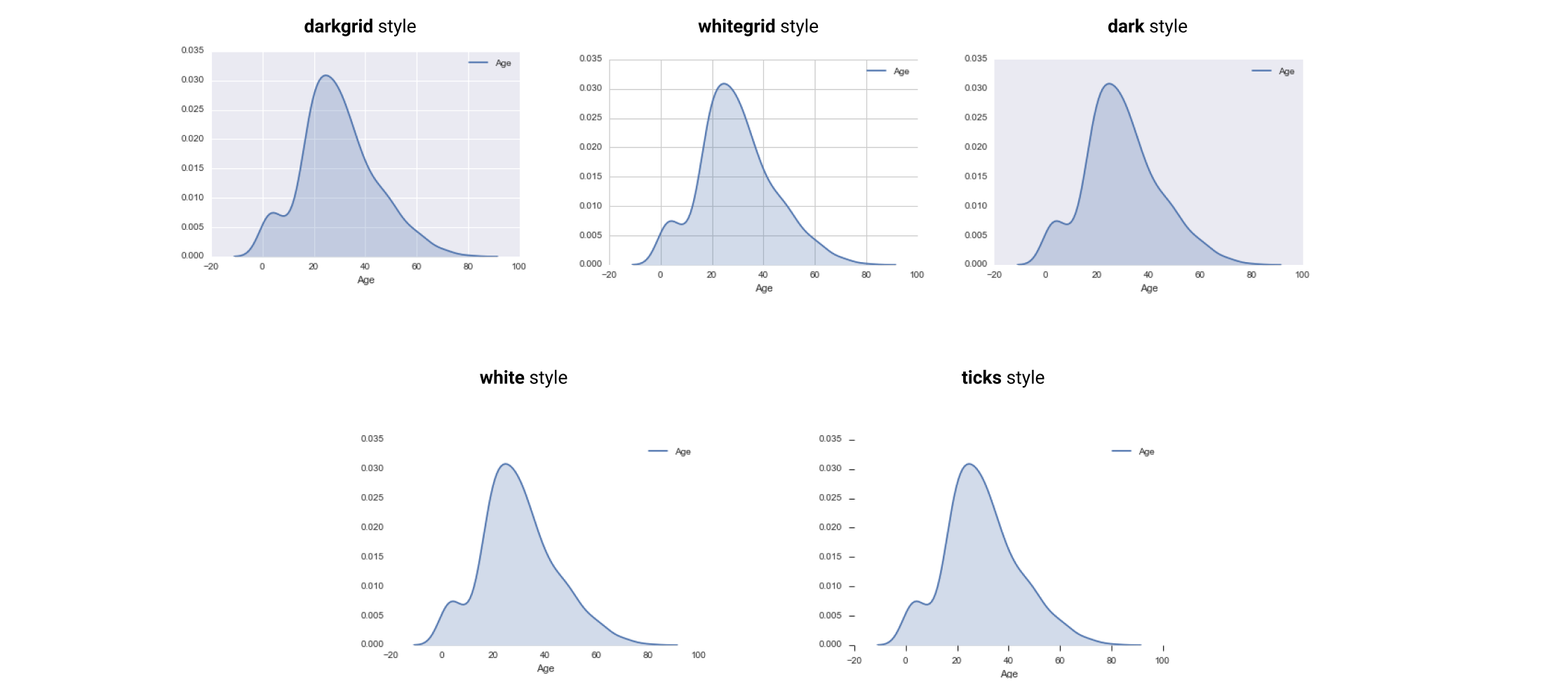
-
Remove axes spines in seaborn:
sns.despine(), default, it removes top right, if one wants to remove bottom left, usesns.despine(left=True, bottom=True)sns.set_style("white") sns.kdeplot(titanic["Age"], shade=True) sns.despine(bottom=True, left=True) plt.xlabel("Age") plt.show() -
Small multiple plots (automaticallt with
seaborn)# Condition on unique values of the "Survived" column. g = sns.FacetGrid(titanic, col="Survived", size=6) # For each subset of values, generate a kernel density plot of the "Age" columns. g.map(sns.kdeplot, "Age", shade=True)- “facet” likes “subset”
col="Survived", number of subplots depend on the number of unique values in this columnsize=6, 6 inch height for each subplot.
-
Two conditions (
colfor condition “Survived”,rowfor condition “Pclass”)g = sns.FacetGrid(titanic, col="Survived", row="Pclass") g.map(sns.kdeplot, "Age", shade=True) sns.despine(left=True, bottom=True) plt.show() -
Three conditions (use
hue) (overlap plot with the previous ones)g = sns.FacetGrid(titanic, col="Survived", row="Pclass", hue="Sex") g.map(sns.kdeplot, "Age", shade=True) g.add_legend() # add legend for seaborn sns sns.despine(left=True, bottom=True) plt.show()
Mission 150: Visualizing Geographic Data
-
basemap toolkit: Basemap is an extension to Matplotlib that makes it easier to work with geographic data.
# install conda install basemap # or conda install -c conda-forge basemap - You’ll want to import matplotlib.pyplot into your environment when you use Basemap
-
Create a new basemap instance
import matplotlib.pyplot as plt from mpl_toolkits.basemap import Basemap m = Basemap(projection='merc',llcrnrlat=-80,urcrnrlat=80,llcrnrlon=-180,urcrnrlon=180) -
Convert the longitude values from spherical to Cartesian
longitudes = airports["longitude"].tolist() latitudes = airports["latitude"].tolist() x, y = m(longitudes, latitudes) -
A scatter plot in basemap:
m.scatter()with the same parameters as inplt.scatter().m = Basemap(projection='merc', llcrnrlat=-80, urcrnrlat=80, llcrnrlon=-180, urcrnrlon=180) longitudes = airports["longitude"].tolist() latitudes = airports["latitude"].tolist() x, y = m(longitudes, latitudes) m.scatter(x, y, s=1) # size of dot is 1 m.drawcoastlines() # show the coastlines plt.show() - A great circle between 2 points on a map. In 2D, it’s a line.
fig, ax = plt.subplots(figsize=(15,20))
m = Basemap(projection='merc', llcrnrlat=-80, urcrnrlat=80, llcrnrlon=-180, urcrnrlon=180)
m.drawcoastlines()

def create_great_circles(df):
    for idx, s in df.iterrows():
        if abs(s["end_lat"] - s["start_lat"] < 180) and abs(s["end_lon"] - s["start_lon"] < 180):
            m.drawgreatcircle(s["start_lon"], s["start_lat"], s["end_lon"], s["end_lat"])

dfw = geo_routes.loc[geo_routes["source"]=="DFM"]
create_great_circles(dfw)
plt.show()
More tools
- Creating 3D plots using Plotly
- Creating interactive visualizations using bokeh
- Creating interactive map visualizations using folium