

Data Analysis with Python
Module 5: Model Evaluation and Refinement
We have built models and made predictions of vehicle prices. Now we will determine how accurate these predictions are.
This dataset was hosted on IBM Cloud object click HERE for free storage.
import pandas as pd
import numpy as np

# Import clean data
path = 'https://s3-api.us-geo.objectstorage.softlayer.net/cf-courses-data/CognitiveClass/DA0101EN/module_5_auto.csv'
df = pd.read_csv(path)
df.to_csv('module_5_auto.csv')
First lets only use numeric data
df=df._get_numeric_data()
df.head()
Libraries for plotting
%%capture
! pip install ipywidgets
from IPython.display import display
from IPython.html import widgets
from IPython.display import display
from ipywidgets import interact, interactive, fixed, interact_manual
Functions for plotting
def DistributionPlot(RedFunction, BlueFunction, RedName, BlueName, Title):
    width = 12
    height = 10
    plt.figure(figsize=(width, height))

    ax1 = sns.distplot(RedFunction, hist=False, color="r", label=RedName)
    ax2 = sns.distplot(BlueFunction, hist=False, color="b", label=BlueName, ax=ax1)

    plt.title(Title)
    plt.xlabel('Price (in dollars)')
    plt.ylabel('Proportion of Cars')

    plt.show()
    plt.close()
def PollyPlot(xtrain, xtest, y_train, y_test, lr,poly_transform):
    width = 12
    height = 10
    plt.figure(figsize=(width, height))


    #training data
    #testing data
    # lr:  linear regression object
    #poly_transform:  polynomial transformation object

    xmax=max([xtrain.values.max(), xtest.values.max()])

    xmin=min([xtrain.values.min(), xtest.values.min()])

    x=np.arange(xmin, xmax, 0.1)


    plt.plot(xtrain, y_train, 'ro', label='Training Data')
    plt.plot(xtest, y_test, 'go', label='Test Data')
    plt.plot(x, lr.predict(poly_transform.fit_transform(x.reshape(-1, 1))), label='Predicted Function')
    plt.ylim([-10000, 60000])
    plt.ylabel('Price')
    plt.legend()
Part 1: Training and Testing
An important step in testing your model is to split your data into training and testing data. We will place the target data price in a separate dataframe y:
y_data = df['price']
drop price data in x data
x_data=df.drop('price',axis=1)
Now we randomly split our data into training and testing data using the function train_test_split.
from sklearn.model_selection import train_test_split


x_train, x_test, y_train, y_test = train_test_split(x_data, y_data, test_size=0.15, random_state=1)


print("number of test samples :", x_test.shape[0])
print("number of training samples:",x_train.shape[0])
The test_size parameter sets the proportion of data that is split into the testing set. In the above, the testing set is set to 10% of the total dataset.
Question #1):
Use the function "train_test_split" to split up the data set such that 40% of the data samples will be utilized for testing, set the parameter "random_state" equal to zero. The output of the function should be the following: "x_train_1" , "x_test_1", "y_train_1" and "y_test_1".# Write your code below and press Shift+Enter to execute
x_train_1, x_test_1, y_train_1, y_test_1 = train_test_split(x_data, y_data, test_size=0.4, random_state=0)
print("number of test samples :", x_test_1.shape[0])
print("number of training samples:",x_train_1.shape[0])
Double-click here for the solution.
Let's import LinearRegression from the module linear_model.
from sklearn.linear_model import LinearRegression
We create a Linear Regression object:
lre=LinearRegression()
we fit the model using the feature horsepower
lre.fit(x_train[['horsepower']], y_train)
Let's Calculate the R^2 on the test data:
lre.score(x_test[['horsepower']], y_test)
we can see the R^2 is much smaller using the test data.
lre.score(x_train[['horsepower']], y_train)
Question #2):
Find the R^2 on the test data using 90% of the data for training data# Write your code below and press Shift+Enter to execute
x_train1, x_test1, y_train1, y_test1 = train_test_split(x_data, y_data, test_size=0.1, random_state=0)
lre.fit(x_train1[['horsepower']],y_train1)
lre.score(x_test1[['horsepower']],y_test1)
Double-click here for the solution.
Sometimes you do not have sufficient testing data; as a result, you may want to perform Cross-validation. Let's go over several methods that you can use for Cross-validation.
Cross-validation Score
Lets import model_selection from the module cross_val_score.
from sklearn.model_selection import cross_val_score
We input the object, the feature in this case ' horsepower', the target data (y_data). The parameter 'cv' determines the number of folds; in this case 4.
Rcross = cross_val_score(lre, x_data[['horsepower']], y_data, cv=4)
The default scoring is R^2; each element in the array has the average R^2 value in the fold:
Rcross
We can calculate the average and standard deviation of our estimate:
print("The mean of the folds are", Rcross.mean(), "and the standard deviation is" , Rcross.std())
We can use negative squared error as a score by setting the parameter 'scoring' metric to 'neg_mean_squared_error'.
-1 * cross_val_score(lre,x_data[['horsepower']], y_data,cv=4,scoring='neg_mean_squared_error')
Question #3):
Calculate the average R^2 using two folds, find the average R^2 for the second fold utilizing the horsepower as a feature :# Write your code below and press Shift+Enter to execute
Rcross2 = cross_val_score(lre, x_data[['horsepower']], y_data, cv=2)
Rcross2[1]
Double-click here for the solution.
You can also use the function 'cross_val_predict' to predict the output. The function splits up the data into the specified number of folds, using one fold to get a prediction while the rest of the folds are used as test data. First import the function:
from sklearn.model_selection import cross_val_predict
We input the object, the feature in this case 'horsepower' , the target data y_data. The parameter 'cv' determines the number of folds; in this case 4. We can produce an output:
yhat = cross_val_predict(lre,x_data[['horsepower']], y_data,cv=4)
yhat[0:5]
Part 2: Overfitting, Underfitting and Model Selection
It turns out that the test data sometimes referred to as the out of sample data is a much better measure of how well your model performs in the real world. One reason for this is overfitting; let's go over some examples. It turns out these differences are more apparent in Multiple Linear Regression and Polynomial Regression so we will explore overfitting in that context.
Let's create Multiple linear regression objects and train the model using 'horsepower', 'curb-weight', 'engine-size' and 'highway-mpg' as features.
lr = LinearRegression()
lr.fit(x_train[['horsepower', 'curb-weight', 'engine-size', 'highway-mpg']], y_train)
Prediction using training data:
yhat_train = lr.predict(x_train[['horsepower', 'curb-weight', 'engine-size', 'highway-mpg']])
yhat_train[0:5]
Prediction using test data:
yhat_test = lr.predict(x_test[['horsepower', 'curb-weight', 'engine-size', 'highway-mpg']])
yhat_test[0:5]
Let's perform some model evaluation using our training and testing data separately. First we import the seaborn and matplotlibb library for plotting.
import matplotlib.pyplot as plt
%matplotlib inline
import seaborn as sns
Let's examine the distribution of the predicted values of the training data.
Title = 'Distribution  Plot of  Predicted Value Using Training Data vs Training Data Distribution'
DistributionPlot(y_train, yhat_train, "Actual Values (Train)", "Predicted Values (Train)", Title)

Figure 1: Plot of predicted values using the training data compared to the training data.
So far the model seems to be doing well in learning from the training dataset. But what happens when the model encounters new data from the testing dataset? When the model generates new values from the test data, we see the distribution of the predicted values is much different from the actual target values.
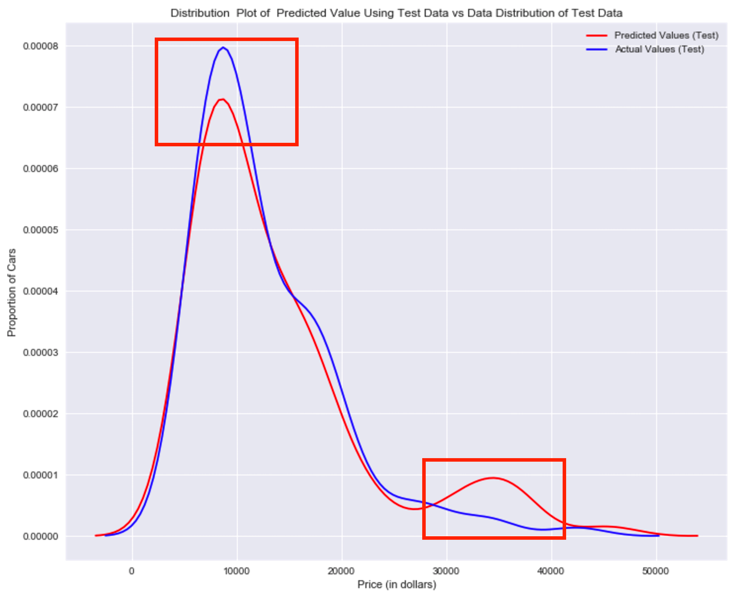
Title='Distribution  Plot of  Predicted Value Using Test Data vs Data Distribution of Test Data'
DistributionPlot(y_test,yhat_test,"Actual Values (Test)","Predicted Values (Test)",Title)

Figur 2: Plot of predicted value using the test data compared to the test data.
Comparing Figure 1 and Figure 2; it is evident the distribution of the test data in Figure 1 is much better at fitting the data. This difference in Figure 2 is apparent where the ranges are from 5000 to 15 000. This is where the distribution shape is exceptionally different. Let's see if polynomial regression also exhibits a drop in the prediction accuracy when analysing the test dataset.
from sklearn.preprocessing import PolynomialFeatures
Overfitting
Overfitting occurs when the model fits the noise, not the underlying process. Therefore when testing your model using the test-set, your model does not perform as well as it is modelling noise, not the underlying process that generated the relationship. Let's create a degree 5 polynomial model.
Let's use 55 percent of the data for testing and the rest for training:
x_train, x_test, y_train, y_test = train_test_split(x_data, y_data, test_size=0.45, random_state=0)
We will perform a degree 5 polynomial transformation on the feature 'horse power'.
pr = PolynomialFeatures(degree=5)
x_train_pr = pr.fit_transform(x_train[['horsepower']])
x_test_pr = pr.fit_transform(x_test[['horsepower']])
pr
Now let's create a linear regression model "poly" and train it.
poly = LinearRegression()
poly.fit(x_train_pr, y_train)
We can see the output of our model using the method "predict." then assign the values to "yhat".
yhat = poly.predict(x_test_pr)
yhat[0:5]
Let's take the first five predicted values and compare it to the actual targets.
print("Predicted values:", yhat[0:4])
print("True values:", y_test[0:4].values)
We will use the function "PollyPlot" that we defined at the beginning of the lab to display the training data, testing data, and the predicted function.
PollyPlot(x_train[['horsepower']], x_test[['horsepower']], y_train, y_test, poly,pr)

Figur 4 A polynomial regression model, red dots represent training data, green dots represent test data, and the blue line represents the model prediction.
We see that the estimated function appears to track the data but around 200 horsepower, the function begins to diverge from the data points.
R^2 of the training data:
poly.score(x_train_pr, y_train)
R^2 of the test data:
poly.score(x_test_pr, y_test)
We see the R^2 for the training data is 0.5567 while the R^2 on the test data was -29.87. The lower the R^2, the worse the model, a Negative R^2 is a sign of overfitting.
Let's see how the R^2 changes on the test data for different order polynomials and plot the results:
Rsqu_test = []

order = [1, 2, 3, 4]
for n in order:
    pr = PolynomialFeatures(degree=n)

    x_train_pr = pr.fit_transform(x_train[['horsepower']])

    x_test_pr = pr.fit_transform(x_test[['horsepower']])

    lr.fit(x_train_pr, y_train)

    Rsqu_test.append(lr.score(x_test_pr, y_test))

plt.plot(order, Rsqu_test)
plt.xlabel('order')
plt.ylabel('R^2')
plt.title('R^2 Using Test Data')
plt.text(3, 0.75, 'Maximum R^2 ')

We see the R^2 gradually increases until an order three polynomial is used. Then the R^2 dramatically decreases at four.
The following function will be used in the next section; please run the cell.
def f(order, test_data):
    x_train, x_test, y_train, y_test = train_test_split(x_data, y_data, test_size=test_data, random_state=0)
    pr = PolynomialFeatures(degree=order)
    x_train_pr = pr.fit_transform(x_train[['horsepower']])
    x_test_pr = pr.fit_transform(x_test[['horsepower']])
    poly = LinearRegression()
    poly.fit(x_train_pr,y_train)
    PollyPlot(x_train[['horsepower']], x_test[['horsepower']], y_train,y_test, poly, pr)
The following interface allows you to experiment with different polynomial orders and different amounts of data.
interact(f, order=(0, 6, 1), test_data=(0.05, 0.95, 0.05))

Question #4a):
We can perform polynomial transformations with more than one feature. Create a "PolynomialFeatures" object "pr1" of degree two?pr1=PolynomialFeatures(degree=2)
Double-click here for the solution.
Question #4b):
Transform the training and testing samples for the features 'horsepower', 'curb-weight', 'engine-size' and 'highway-mpg'. Hint: use the method "fit_transform" ?x_train_pr1=pr.fit_transform(x_train[['horsepower', 'curb-weight', 'engine-size', 'highway-mpg']])
x_test_pr1=pr.fit_transform(x_test[['horsepower', 'curb-weight', 'engine-size', 'highway-mpg']])
Double-click here for the solution.
Question #4c):
How many dimensions does the new feature have? Hint: use the attribute "shape"x_train_pr1.shape
Double-click here for the solution.
Question #4d):
Create a linear regression model "poly1" and train the object using the method "fit" using the polynomial features?import sklearn.linear_model as linear_model
poly1=linear_model.LinearRegression().fit(x_train_pr1,y_train)
Double-click here for the solution.
Question #4e):
Use the method "predict" to predict an output on the polynomial features, then use the function "DistributionPlot" to display the distribution of the predicted output vs the test data?yhat_test1=poly1.predict(x_train_pr1)
Title='Distribution Plot of Predicted Value Using Test Data vs Data Distribution of Test Data'
DistributionPlot(y_test, yhat_test1, "Actual Values (Test)", "Predicted Values (Test)", Title)

Double-click here for the solution.
Question #4f):
Use the distribution plot to determine the two regions were the predicted prices are less accurate than the actual prices.The predicted value is lower than actual value for cars where the price 30, 000 to $40,000 range. As such the model is not as accurate in these ranges .
Double-click here for the solution.
Part 3: Ridge regression
In this section, we will review Ridge Regression we will see how the parameter Alfa changes the model. Just a note here our test data will be used as validation data.
Let's perform a degree two polynomial transformation on our data.
pr=PolynomialFeatures(degree=2)
x_train_pr=pr.fit_transform(x_train[['horsepower', 'curb-weight', 'engine-size', 'highway-mpg','normalized-losses','symboling']])
x_test_pr=pr.fit_transform(x_test[['horsepower', 'curb-weight', 'engine-size', 'highway-mpg','normalized-losses','symboling']])
Let's import Ridge from the module linear models.
from sklearn.linear_model import Ridge
Let's create a Ridge regression object, setting the regularization parameter to 0.1
RigeModel=Ridge(alpha=0.1)
Like regular regression, you can fit the model using the method fit.
RigeModel.fit(x_train_pr, y_train)
Similarly, you can obtain a prediction:
yhat = RigeModel.predict(x_test_pr)
Let's compare the first five predicted samples to our test set
print('predicted:', yhat[0:4])
print('test set :', y_test[0:4].values)
We select the value of Alfa that minimizes the test error, for example, we can use a for loop.
Rsqu_test = []
Rsqu_train = []
dummy1 = []
ALFA = 10 * np.array(range(0,1000))
for alfa in ALFA:
    RigeModel = Ridge(alpha=alfa)
    RigeModel.fit(x_train_pr, y_train)
    Rsqu_test.append(RigeModel.score(x_test_pr, y_test))
    Rsqu_train.append(RigeModel.score(x_train_pr, y_train))
We can plot out the value of R^2 for different Alphas
width = 12
height = 10
plt.figure(figsize=(width, height))

plt.plot(ALFA,Rsqu_test, label='validation data  ')
plt.plot(ALFA,Rsqu_train, 'r', label='training Data ')
plt.xlabel('alpha')
plt.ylabel('R^2')
plt.legend()

Figure 6:The blue line represents the R^2 of the test data, and the red line represents the R^2 of the training data. The x-axis represents the different values of Alfa
The red line in figure 6 represents the R^2 of the test data, as Alpha increases the R^2 decreases; therefore as Alfa increases the model performs worse on the test data. The blue line represents the R^2 on the validation data, as the value for Alfa increases the R^2 decreases.
Question #5):
Perform Ridge regression and calculate the R^2 using the polynomial features, use the training data to train the model and test data to test the model. The parameter alpha should be set to 10.# Write your code below and press Shift+Enter to execute
RigeModel = Ridge(alpha=0)
RigeModel.fit(x_train_pr, y_train)
RigeModel.score(x_test_pr, y_test)
Double-click here for the solution.
Part 4: Grid Search
The term Alfa is a hyperparameter, sklearn has the class GridSearchCV to make the process of finding the best hyperparameter simpler.
Let's import GridSearchCV from the module model_selection.
from sklearn.model_selection import GridSearchCV
We create a dictionary of parameter values:
parameters1= [{'alpha': [0.001,0.1,1, 10, 100, 1000, 10000, 100000, 100000]}]
parameters1
Create a ridge regions object:
RR=Ridge()
RR
Create a ridge grid search object
Grid1 = GridSearchCV(RR, parameters1,cv=4)
Fit the model
Grid1.fit(x_data[['horsepower', 'curb-weight', 'engine-size', 'highway-mpg']], y_data)
The object finds the best parameter values on the validation data. We can obtain the estimator with the best parameters and assign it to the variable BestRR as follows:
BestRR=Grid1.best_estimator_
BestRR
We now test our model on the test data
BestRR.score(x_test[['horsepower', 'curb-weight', 'engine-size', 'highway-mpg']], y_test)
Question #6):
Perform a grid search for the alpha parameter and the normalization parameter, then find the best values of the parameters# Write your code below and press Shift+Enter to execute
parameters2= [{'alpha': [0.001,0.1,1, 10, 100, 1000,10000,100000,100000],'normalize':[True,False]} ]
Grid2 = GridSearchCV(Ridge(), parameters2,cv=4)
Grid2.fit(x_data[['horsepower', 'curb-weight', 'engine-size', 'highway-mpg']],y_data)
Grid2.best_estimator_
Double-click here for the solution.
Thank you for completing this notebook!

About the Authors:
This notebook was written by Mahdi Noorian PhD, Joseph Santarcangelo, Bahare Talayian, Eric Xiao, Steven Dong, Parizad, Hima Vsudevan and Fiorella Wenver and Yi Yao.
Joseph Santarcangelo is a Data Scientist at IBM, and holds a PhD in Electrical Engineering. His research focused on using Machine Learning, Signal Processing, and Computer Vision to determine how videos impact human cognition. Joseph has been working for IBM since he completed his PhD.
Copyright © 2018 IBM Developer Skills Network. This notebook and its source code are released under the terms of the MIT License.