
Generating Maps with Python
Introduction
In this lab, we will learn how to create maps for different objectives. To do that, we will part ways with Matplotlib and work with another Python visualization library, namely Folium. What is nice about Folium is that it was developed for the sole purpose of visualizing geospatial data. While other libraries are available to visualize geospatial data, such as plotly, they might have a cap on how many API calls you can make within a defined time frame. Folium, on the other hand, is completely free.
Table of Contents
Exploring Datasets with pandas and Matplotlib
Toolkits: This lab heavily relies on pandas and Numpy for data wrangling, analysis, and visualization. The primary plotting library we will explore in this lab is Folium.
Datasets:
San Francisco Police Department Incidents for the year 2016 - Police Department Incidents from San Francisco public data portal. Incidents derived from San Francisco Police Department (SFPD) Crime Incident Reporting system. Updated daily, showing data for the entire year of 2016. Address and location has been anonymized by moving to mid-block or to an intersection.
Immigration to Canada from 1980 to 2013 - International migration flows to and from selected countries - The 2015 revision from United Nation's website. The dataset contains annual data on the flows of international migrants as recorded by the countries of destination. The data presents both inflows and outflows according to the place of birth, citizenship or place of previous / next residence both for foreigners and nationals. For this lesson, we will focus on the Canadian Immigration data
Downloading and Prepping Data 
Import Primary Modules:
import numpy as np  # useful for many scientific computing in Python
import pandas as pd # primary data structure library
Introduction to Folium 
Folium is a powerful Python library that helps you create several types of Leaflet maps. The fact that the Folium results are interactive makes this library very useful for dashboard building.
From the official Folium documentation page:
Folium builds on the data wrangling strengths of the Python ecosystem and the mapping strengths of the Leaflet.js library. Manipulate your data in Python, then visualize it in on a Leaflet map via Folium.
Folium makes it easy to visualize data that's been manipulated in Python on an interactive Leaflet map. It enables both the binding of data to a map for choropleth visualizations as well as passing Vincent/Vega visualizations as markers on the map.
The library has a number of built-in tilesets from OpenStreetMap, Mapbox, and Stamen, and supports custom tilesets with Mapbox or Cloudmade API keys. Folium supports both GeoJSON and TopoJSON overlays, as well as the binding of data to those overlays to create choropleth maps with color-brewer color schemes.
Let's install Folium
Folium is not available by default. So, we first need to install it before we are able to import it.
!conda install -c conda-forge folium=0.5.0 --yes
import folium

print('Folium installed and imported!')
Generating the world map is straigtforward in Folium. You simply create a Folium Map object and then you display it. What is attactive about Folium maps is that they are interactive, so you can zoom into any region of interest despite the initial zoom level.
# define the world map
world_map = folium.Map()

# display world map
world_map
Go ahead. Try zooming in and out of the rendered map above.
You can customize this default definition of the world map by specifying the centre of your map and the intial zoom level.
All locations on a map are defined by their respective Latitude and Longitude values. So you can create a map and pass in a center of Latitude and Longitude values of [0, 0].
For a defined center, you can also define the intial zoom level into that location when the map is rendered. The higher the zoom level the more the map is zoomed into the center.
Let's create a map centered around Canada and play with the zoom level to see how it affects the rendered map.
# define the world map centered around Canada with a low zoom level
world_map = folium.Map(location=[56.130, -106.35], zoom_start=4)

# display world map
world_map
Let's create the map again with a higher zoom level
# define the world map centered around Canada with a higher zoom level
world_map = folium.Map(location=[56.130, -106.35], zoom_start=8)

# display world map
world_map
As you can see, the higher the zoom level the more the map is zoomed into the given center.
Question: Create a map of Mexico with a zoom level of 4.
### type your answer here
mexico_latitude = 23.6345
mexico_longitude = -102.5528
mexico_map = folium.Map(location=[mexico_latitude, mexico_longitude], zoom_start=4)
mexico_map
Double-click here for the solution.
Another cool feature of Folium is that you can generate different map styles.
A. Stamen Toner Maps
These are high-contrast B+W (black and white) maps. They are perfect for data mashups and exploring river meanders and coastal zones.
Let's create a Stamen Toner map of canada with a zoom level of 4.
# create a Stamen Toner map of the world centered around Canada
world_map = folium.Map(location=[56.130, -106.35], zoom_start=4, tiles='Stamen Toner')

# display map
world_map
Feel free to zoom in and out to see how this style compares to the default one.
B. Stamen Terrain Maps
These are maps that feature hill shading and natural vegetation colors. They showcase advanced labeling and linework generalization of dual-carriageway roads.
Let's create a Stamen Terrain map of Canada with zoom level 4.
# create a Stamen Toner map of the world centered around Canada
world_map = folium.Map(location=[56.130, -106.35], zoom_start=4, tiles='Stamen Terrain')

# display map
world_map
Feel free to zoom in and out to see how this style compares to Stamen Toner and the default style.
C. Mapbox Bright Maps
These are maps that quite similar to the default style, except that the borders are not visible with a low zoom level. Furthermore, unlike the default style where country names are displayed in each country's native language, Mapbox Bright style displays all country names in English.
Let's create a world map with this style.
# create a world map with a Mapbox Bright style.
world_map = folium.Map(tiles='Mapbox Bright')

# display the map
world_map
Zoom in and notice how the borders start showing as you zoom in, and the displayed country names are in English.
Question: Create a map of Mexico to visualize its hill shading and natural vegetation. Use a zoom level of 6.
### type your answer here
mexico_latitude = 23.6345
mexico_longitude = -102.5528
mexico_map = folium.Map(location=[mexico_latitude, mexico_longitude], zoom_start=6, tiles='Stamen Terrain')
mexico_map
Double-click here for the solution.
Maps with Markers 
Let's download and import the data on police department incidents using pandas read_csv() method.
Download the dataset and read it into a pandas dataframe:
df_incidents = pd.read_csv('https://ibm.box.com/shared/static/nmcltjmocdi8sd5tk93uembzdec8zyaq.csv')

print('Dataset downloaded and read into a pandas dataframe!')
Let's take a look at the first five items in our dataset.
df_incidents.head()
So each row consists of 13 features:
- IncidntNum: Incident Number
- Category: Category of crime or incident
- Descript: Description of the crime or incident
- DayOfWeek: The day of week on which the incident occurred
- Date: The Date on which the incident occurred
- Time: The time of day on which the incident occurred
- PdDistrict: The police department district
- Resolution: The resolution of the crime in terms whether the perpetrator was arrested or not
- Address: The closest address to where the incident took place
- X: The longitude value of the crime location
- Y: The latitude value of the crime location
- Location: A tuple of the latitude and the longitude values
- PdId: The police department ID
Let's find out how many entries there are in our dataset.
df_incidents.shape
So the dataframe consists of 150,500 crimes, which took place in the year 2016. In order to reduce computational cost, let's just work with the first 100 incidents in this dataset.
# get the first 100 crimes in the df_incidents dataframe
limit = 100
df_incidents = df_incidents.iloc[0:limit, :]
Let's confirm that our dataframe now consists only of 100 crimes.
df_incidents.shape
Now that we reduced the data a little bit, let's visualize where these crimes took place in the city of San Francisco. We will use the default style and we will initialize the zoom level to 12.
# San Francisco latitude and longitude values
latitude = 37.77
longitude = -122.42
# create map and display it
sanfran_map = folium.Map(location=[latitude, longitude], zoom_start=12)

# display the map of San Francisco
sanfran_map
Now let's superimpose the locations of the crimes onto the map. The way to do that in Folium is to create a feature group with its own features and style and then add it to the sanfran_map.
# instantiate a feature group for the incidents in the dataframe
incidents = folium.map.FeatureGroup()

# loop through the 100 crimes and add each to the incidents feature group
for lat, lng, in zip(df_incidents.Y, df_incidents.X):
    incidents.add_child(
        folium.features.CircleMarker(
            [lat, lng],
            radius=5, # define how big you want the circle markers to be
            color='yellow',
            fill=True,
            fill_color='blue',
            fill_opacity=0.6
        )
    )

# add incidents to map
sanfran_map.add_child(incidents)
You can also add some pop-up text that would get displayed when you hover over a marker. Let's make each marker display the category of the crime when hovered over.
# instantiate a feature group for the incidents in the dataframe
incidents = folium.map.FeatureGroup()

# loop through the 100 crimes and add each to the incidents feature group
for lat, lng, in zip(df_incidents.Y, df_incidents.X):
    incidents.add_child(
        folium.features.CircleMarker(
            [lat, lng],
            radius=5, # define how big you want the circle markers to be
            color='yellow',
            fill=True,
            fill_color='blue',
            fill_opacity=0.6
        )
    )

# add pop-up text to each marker on the map
latitudes = list(df_incidents.Y)
longitudes = list(df_incidents.X)
labels = list(df_incidents.Category)

for lat, lng, label in zip(latitudes, longitudes, labels):
    folium.Marker([lat, lng], popup=label).add_to(sanfran_map)

# add incidents to map
sanfran_map.add_child(incidents)
Isn't this really cool? Now you are able to know what crime category occurred at each marker.
If you find the map to be so congested will all these markers, there are two remedies to this problem. The simpler solution is to remove these location markers and just add the text to the circle markers themselves as follows:
# create map and display it
sanfran_map = folium.Map(location=[latitude, longitude], zoom_start=12)

# loop through the 100 crimes and add each to the map
for lat, lng, label in zip(df_incidents.Y, df_incidents.X, df_incidents.Category):
    folium.features.CircleMarker(
        [lat, lng],
        radius=5, # define how big you want the circle markers to be
        color='yellow',
        fill=True,
        popup=label,
        fill_color='blue',
        fill_opacity=0.6
    ).add_to(sanfran_map)

# show map
sanfran_map
The other proper remedy is to group the markers into different clusters. Each cluster is then represented by the number of crimes in each neighborhood. These clusters can be thought of as pockets of San Francisco which you can then analyze separately.
To implement this, we start off by instantiating a MarkerCluster object and adding all the data points in the dataframe to this object.
from folium import plugins

# let's start again with a clean copy of the map of San Francisco
sanfran_map = folium.Map(location = [latitude, longitude], zoom_start = 12)

# instantiate a mark cluster object for the incidents in the dataframe
incidents = plugins.MarkerCluster().add_to(sanfran_map)

# loop through the dataframe and add each data point to the mark cluster
for lat, lng, label, in zip(df_incidents.Y, df_incidents.X, df_incidents.Category):
    folium.Marker(
        location=[lat, lng],
        icon=None,
        popup=label,
    ).add_to(incidents)

# display map
sanfran_map
Notice how when you zoom out all the way, all markers are grouped into one cluster, the global cluster, of 100 markers or crimes, which is the total number of crimes in our dataframe. Once you start zooming in, the global cluster will start breaking up into smaller clusters. Zooming in all the way will result in individual markers.
Choropleth Maps 
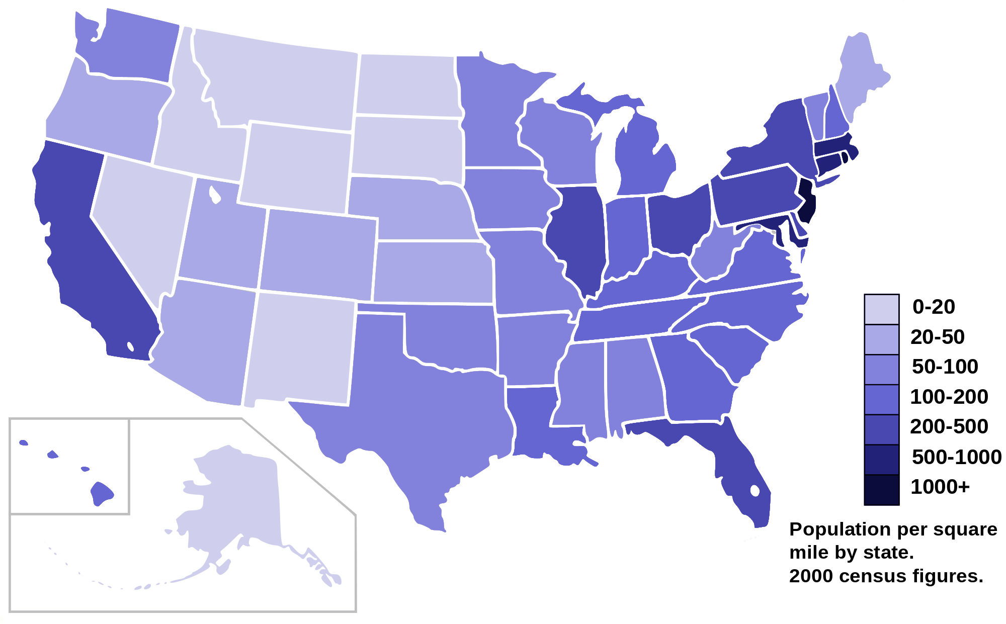
A Choropleth map is a thematic map in which areas are shaded or patterned in proportion to the measurement of the statistical variable being displayed on the map, such as population density or per-capita income. The choropleth map provides an easy way to visualize how a measurement varies across a geographic area or it shows the level of variability within a region. Below is a Choropleth map of the US depicting the population by square mile per state.
Now, let's create our own Choropleth map of the world depicting immigration from various countries to Canada.
Let's first download and import our primary Canadian immigration dataset using pandas read_excel() method. Normally, before we can do that, we would need to download a module which pandas requires to read in excel files. This module is xlrd. For your convenience, we have pre-installed this module, so you would not have to worry about that. Otherwise, you would need to run the following line of code to install the xlrd module:
!conda install -c anaconda xlrd --yes!conda install -c anaconda xlrd --yes
Download the dataset and read it into a pandas dataframe:
df_can = pd.read_excel('https://ibm.box.com/shared/static/lw190pt9zpy5bd1ptyg2aw15awomz9pu.xlsx',
                     sheet_name='Canada by Citizenship',
                     skiprows=range(20),
                     skipfooter=2)

print('Data downloaded and read into a dataframe!')
Let's take a look at the first five items in our dataset.
df_can.head()
Let's find out how many entries there are in our dataset.
# print the dimensions of the dataframe
print(df_can.shape)
Clean up data. We will make some modifications to the original dataset to make it easier to create our visualizations. Refer to Introduction to Matplotlib and Line Plots and Area Plots, Histograms, and Bar Plots notebooks for a detailed description of this preprocessing.
# clean up the dataset to remove unnecessary columns (eg. REG)
df_can.drop(['AREA','REG','DEV','Type','Coverage'], axis=1, inplace=True)

# let's rename the columns so that they make sense
df_can.rename(columns={'OdName':'Country', 'AreaName':'Continent','RegName':'Region'}, inplace=True)

# for sake of consistency, let's also make all column labels of type string
df_can.columns = list(map(str, df_can.columns))

# add total column
df_can['Total'] = df_can.sum(axis=1)

# years that we will be using in this lesson - useful for plotting later on
years = list(map(str, range(1980, 2014)))
print ('data dimensions:', df_can.shape)
Let's take a look at the first five items of our cleaned dataframe.
df_can.head()
In order to create a Choropleth map, we need a GeoJSON file that defines the areas/boundaries of the state, county, or country that we are interested in. In our case, since we are endeavoring to create a world map, we want a GeoJSON that defines the boundaries of all world countries. For your convenience, we will be providing you with this file, so let's go ahead and download it. Let's name it world_countries.json.
# download countries geojson file
!wget --quiet https://ibm.box.com/shared/static/cto2qv7nx6yq19logfcissyy4euo8lho.json -O world_countries.json

print('GeoJSON file downloaded!')
Now that we have the GeoJSON file, let's create a world map, centered around [0, 0] latitude and longitude values, with an intial zoom level of 2, and using Mapbox Bright style.
world_geo = r'world_countries.json' # geojson file

# create a plain world map
world_map = folium.Map(location=[0, 0], zoom_start=2, tiles='Mapbox Bright')
And now to create a Choropleth map, we will use the choropleth method with the following main parameters:
- geo_data, which is the GeoJSON file.
- data, which is the dataframe containing the data.
- columns, which represents the columns in the dataframe that will be used to create the
Choroplethmap. - key_on, which is the key or variable in the GeoJSON file that contains the name of the variable of interest. To determine that, you will need to open the GeoJSON file using any text editor and note the name of the key or variable that contains the name of the countries, since the countries are our variable of interest. In this case, name is the key in the GeoJSON file that contains the name of the countries. Note that this key is case_sensitive, so you need to pass exactly as it exists in the GeoJSON file.
# generate choropleth map using the total immigration of each country to Canada from 1980 to 2013
world_map.choropleth(
    geo_data=world_geo,
    data=df_can,
    columns=['Country', 'Total'],
    key_on='feature.properties.name',
    fill_color='YlOrRd',
    fill_opacity=0.7,
    line_opacity=0.2,
    legend_name='Immigration to Canada'
)

# display map
world_map
As per our Choropleth map legend, the darker the color of a country and the closer the color to red, the higher the number of immigrants from that country. Accordingly, the highest immigration over the course of 33 years (from 1980 to 2013) was from China, India, and the Philippines, followed by Poland, Pakistan, and interestingly, the US.
Notice how the legend is displaying a negative boundary or threshold. Let's fix that by defining our own thresholds and starting with 0 instead of -6,918!
world_geo = r'world_countries.json'

# create a numpy array of length 6 and has linear spacing from the minium total immigration to the maximum total immigration
threshold_scale = np.linspace(df_can['Total'].min(),
                              df_can['Total'].max(),
                              6, dtype=int)
threshold_scale = threshold_scale.tolist() # change the numpy array to a list
threshold_scale[-1] = threshold_scale[-1] + 1 # make sure that the last value of the list is greater than the maximum immigration

# let Folium determine the scale.
world_map = folium.Map(location=[0, 0], zoom_start=2, tiles='Mapbox Bright')
world_map.choropleth(
    geo_data=world_geo,
    data=df_can,
    columns=['Country', 'Total'],
    key_on='feature.properties.name',
    threshold_scale=threshold_scale,
    fill_color='YlOrRd',
    fill_opacity=0.7,
    line_opacity=0.2,
    legend_name='Immigration to Canada',
    reset=True
)
world_map
Much better now! Feel free to play around with the data and perhaps create Choropleth maps for individuals years, or perhaps decades, and see how they compare with the entire period from 1980 to 2013.
Thank you for completing this lab!
This notebook was created by Alex Aklson. I hope you found this lab interesting and educational. Feel free to contact me if you have any questions!
This notebook is part of a course on Coursera called Data Visualization with Python. If you accessed this notebook outside the course, you can take this course online by clicking here.
Copyright © 2018 Cognitive Class. This notebook and its source code are released under the terms of the MIT License.